Everything I’ve seen regarding Google’s new material design language has got me very excited. Rather than just being aware of it though, I wanted to get my hands dirty and experience working with it to gain a true understanding.
To do so, I have redesigned a fairly mundane job board application to follow concepts from Google’s material design guidelines. As well as redesigning the application, I have also fully implemented it in code, so you can see it in action.
This post therefore aims to show why I found material design appealing to use in the first place, and also brief overview of the web application I created.
Why use material design?
Moving away from flat design
The flat design trend was a great improvement on skeuomorphic ideas which had more focus on the look of the interface. Flat design has allowed us to give more attention to functionality and how the interface actually works, thereby making products easier to use.


As with everything though, despite the success of flat design, it can always be improved and evolved into something even better – that’s what Google have helped do with material design.
The Z Axis
Flat design is constrained only to the X and Y axis, meaning objects on a page can only move left to right and up and down. Due to this, all elements share the same plane which can quickly lead to generic interfaces and even difficulty in navigation since action buttons can blend in with the rest of the content. Material design literally adds an extra dimension to the flat design, enabling designers to, according to Google: “synthesize the classic principles of good design with the innovation and possibility of technology and science”.

In providing the extra Z axis, I've personally found there to be more room for creativity, as well as greater opportunity to leverage technological capabilities - this isn't print after all. By combining animation with layout, you can create something with a lot more meaning, and I'd totally agree with how Sinsabaugh (Wired Magazine) puts it:
"If we take anything from Material Design it isn’t how to use color, how your ease timing should be set,or what the resting elevation of an object should be. It’s not the details themselves we take away, it’s how the details combine to create purposeful brand experience."
Material in practice
I applied Google’s material design to a fairly mundane job board website I’d created a couple years ago. It’s made a boring task of searching for jobs a lot more appealing through the use of animations and vibrant colors.
A jobs board, made material
The jobs board starts off with an on-boarding process, asking the user where they want to work, and where. Once the on-boarding is complete, the user receives a list job of recommendations based on their choices. Below is a gif showing the main landing page:
Animation with meaning
This is what's happening in the above gif:
- The card moves in from the bottom the grows take up more screen space.
- The large card with all the information is one of the highest on the Z axis, taking priority.
- The start now button is also raised on top of the card, standing out to the user
Similar animations and material concepts are used in the following pages of the on boarding process, where the user chooses their industry and location:
Authentic Motion
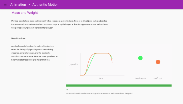
All the animations were implemented following Google’s guidelines on authentic motion, which states that in order to draw attention to specific objects you can vary the change in speed when starting and stopping. This is shown by the green line and dot below:

I like material design
Through implementing a real life product with material design, I've been able to truly see the benefits, and to me they are real. I've enjoyed the way material design borrows concepts from the real world but applies them in a unique way. For that reason, I'm not sure if it is actually skeuomorphic or not - please add your thoughts to the comments below if you've got any idea.
I’ll be writing a follow up post on other concepts of material design. For now, check out the site: http://grad-jobs.com
